V9.2.1
Prerequisites
Before you create a dashboard, you need to:
- Create a dashboard suite.
- Add the relevant queries to your data model.
Create a new dashboard
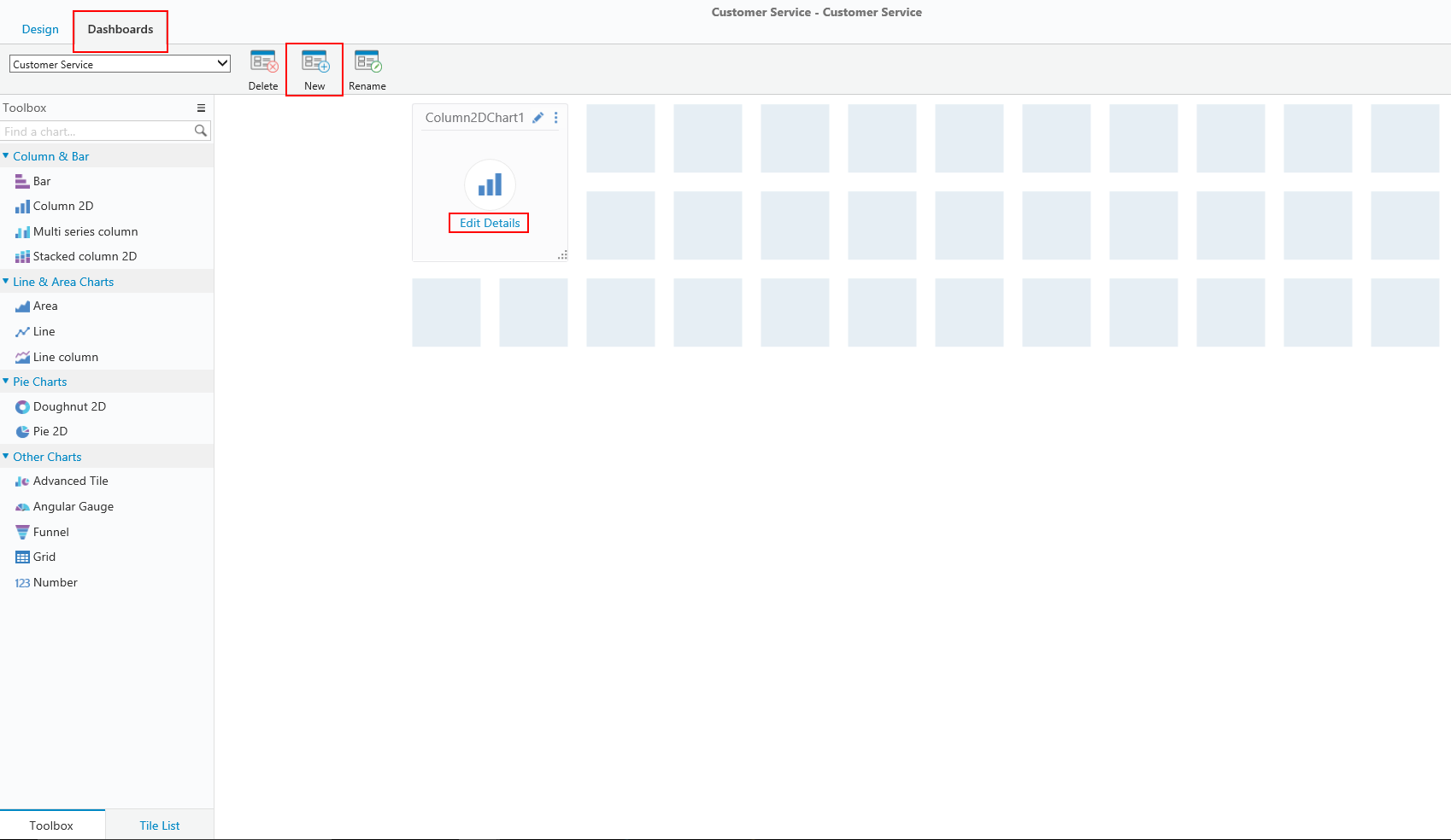
- On the Dashboard Suites page, locate the dashboard suite to which you want to add a dashboard, and click the edit button (
 ).
).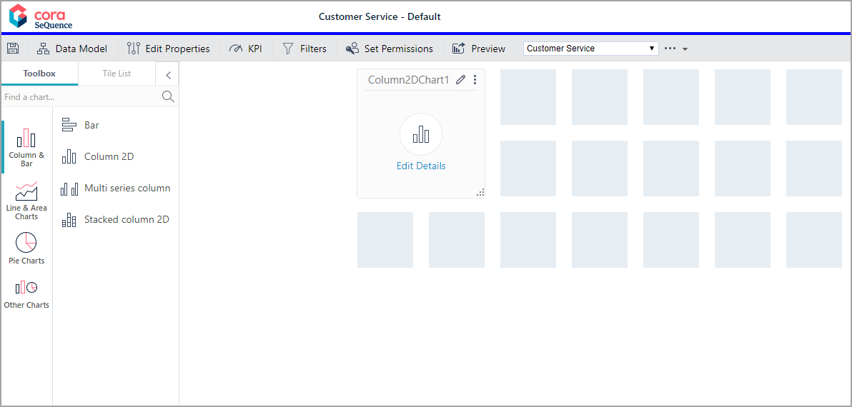 The new dashboard already includes a tile with a bar chart. You can remove it or edit it, and add additional charts.
 - To edit the selected chart, click Edit Details.
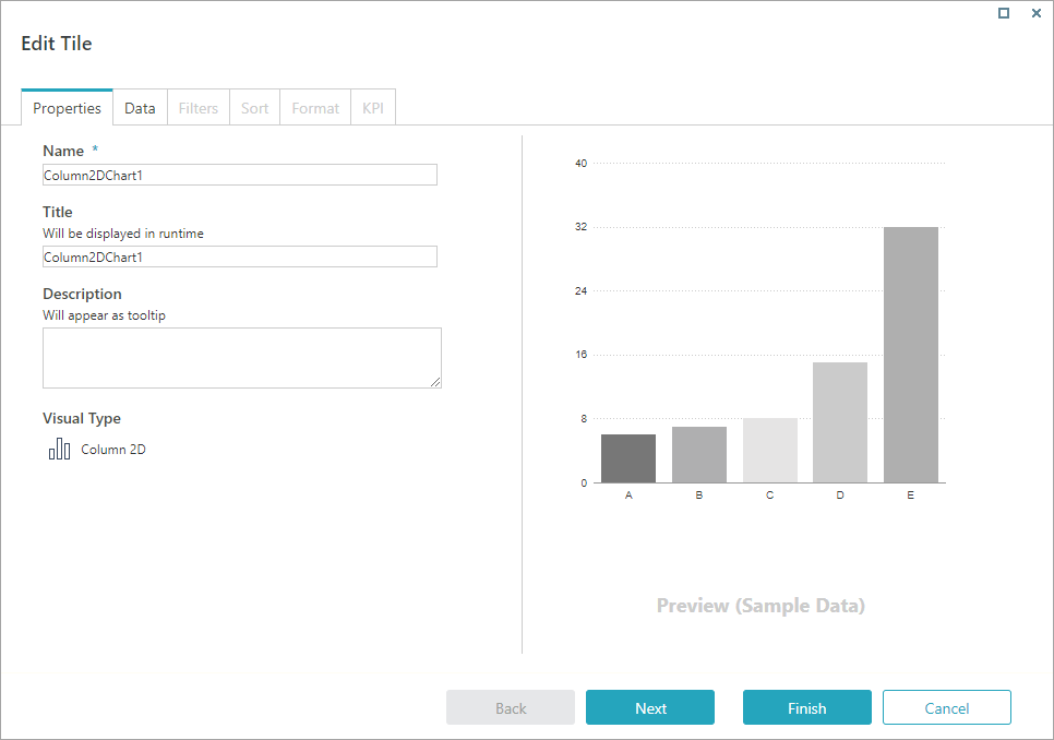
- On the Properties tab:
- Name: Enter a significant name for the chart.
- Title: Enter the name to display on top of the chart when viewed in the Flowtime portal.
- Description: Add a short description of the data displayed by the chart. This text displays as a tooltip when the char is viewed in the Flowtime portal.
- Click Next.
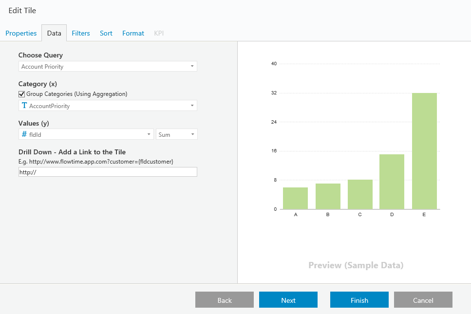
- On the Data tab:
- Select the relevant query as the data source for the chart.
- To define cache settings for the selected query, click Advanced Options.
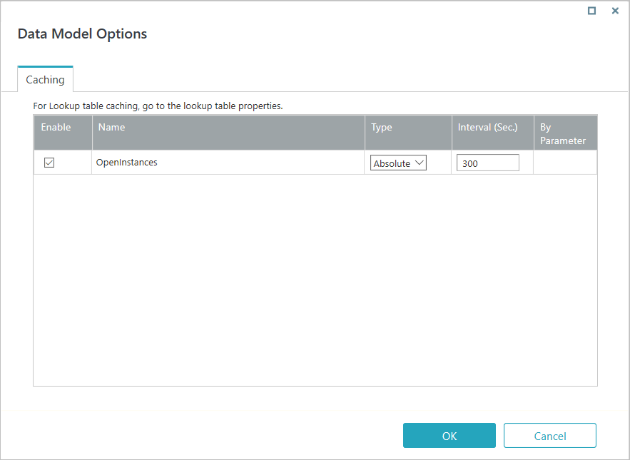 For more information on defining cache settings, see this article.
 - If relevant for the chart, set the X and Y axis.
- To add a link to the dashboard chart, under Drill Down, concatenate the process page that filters by the defined values.
Example:http://{flowtimeserver.com}/ProcessRecords.aspx?workflowSpaceId=09132f64-8d34-43a4-adcc-b842116e1c4c&ft&Customer=eq({fldCustomer})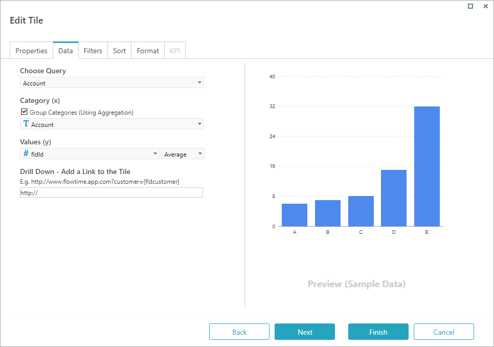
 ).
). The new dashboard already includes a tile with a bar chart. You can remove it or edit it, and add additional charts.
 For more information on defining cache settings, see
TIP
You can also use the Drill Down field to link the entire chart to a Flowtime page. For example, you can add the URL of the Active Processes page to a Number chart.
Copy the link and remove https:// and the server name:Process.aspx?workflowSpaceId=a0923039-78ae-464f-92ad-ffb8d6fc3583&workflowId=b844cc9e-21ea-4fc1-bb06-bee6ce77726c3
- Click Next.
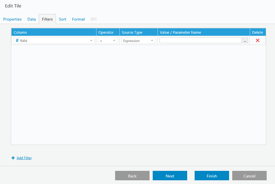
- On the Filters tab, add filters to define the data displayed by the chart.
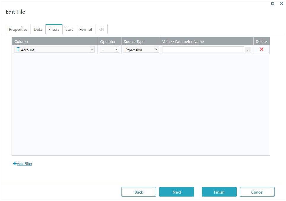
- The Filters tab is populated only if the data query you selected contains filters.
- Only In parameters display.
- A common filter is the Rt.CurrentUser() parameter.
- You can filter an analytics query using a query string parameter.
For more information, see Filter an Analytics Query Using a Query String Parameter article.
- Click Next.
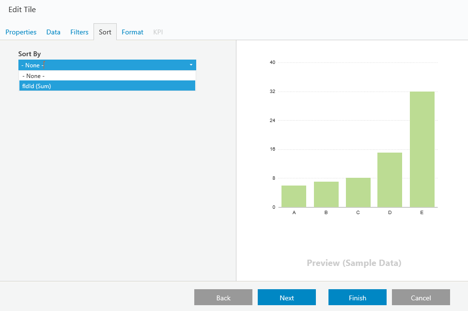
- On the Sort tab, define the parameter by which the data will be sorted in the chart.
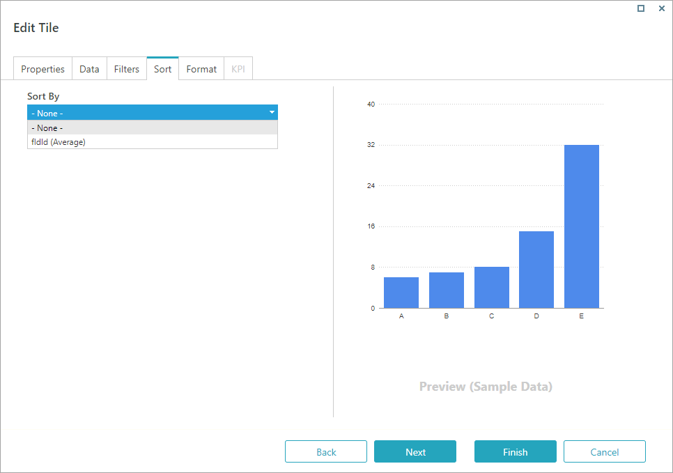
- The Sort tab is available only when you select a lookup table as the data source.
- Click Next.
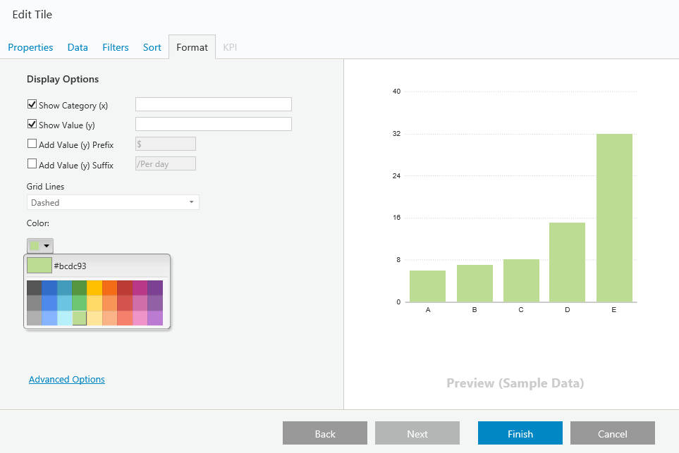
- On the Format tab, set up the chart look and feel:
- Display options: Select the elements to display on the chart.
- Legend: Define if the chart has a legend and where to display it.
- Color Palette: Set up the colors used in the chart.
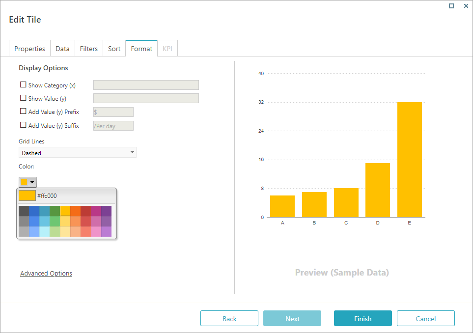
- Use the advanced options to define formatting in JSON.
The JSON formatting overrides the basic formatting.
- Click Save.


NOTE
You can resize a dashboard and drag it to a different location.
The dashboard is responsive and automatically adjusts to the display, but there is no absolute position.
Add links in the dashboard tables
To add links to the dashboard table cells add the following JSON code snippet in the Advanced Options:
{
    "sortable": true,
    "resizable": true,
    "columns": [{
            "template": '<a href="#:data.url#/_layouts/runTime.aspx?culture=en-GB&uiculture=en-GB&workflowInstanceId=#:data.fldIWfId#" target="_blank" >Open</a>',
            "width": 80
        }, {
            "field": "Name",
            "title": "Name",
            "width": 100
        }, {
            "field": "Category",
            "title": "Category",
            "width": 100
        }, {
            "field": "Type",
            "title": "Type",
            "width": 100
        }, {
            "field": "Team",
            "title": "Team",
            "width": 100
        }, {
            "field": "Scenarios",
            "title": "Scenarios",
            "width": 100
        }, {
            "field": "StepDetails",
            "title": "Step Details",
            "width": 300
        }, {
            "field": "ExpectedResults",
            "title": "Expected Results",
            "width": 300
        }, {
            "field": "ActualResults",
            "title": "Actual Results",
            "width": 300
        }, {
            "field": "CaseNumber",
            "title": "Case Number",
            "width": 120
        }
    ]
}
JSON examples
Create a doughnut chart
{
"chart": {
"caption": "Split of Revenue by Product Categories",
"subCaption": "Last year",
"numberPrefix": "$",
"paletteColors": "#0075c2,#1aaf5d,#f2c500,#f45b00,#8e0000,#34495E,#8E44AD,#AED6F1,#F0B27A,#B2BABB,#2471A3" ,
"bgColor": "#ffffff",
"showBorder": "0",
"use3DLighting": "0",
"showShadow": "0",
"enableSmartLabels": "0",
"startingAngle": "310",
"showLabels": "1",
"showPercentValues": "1",
"showLegend": "1",
"legendShadow": "0",
"legendBorderAlpha": "0",
"defaultCenterLabel": "Total revenue: $64.08K",
"centerLabel": "Revenue from $label: $value",
"centerLabelBold": "1",
"showTooltip": "1",
"decimals": "0",
"captionFontSize": "14",
"subcaptionFontSize": "14",
"subcaptionFontBold": "0",
"useDataPlotColorForLabels": "1"}
}
Set green and red as the colors for positive and negative results
{
"chart":{
"palettecolors":"d5534e,6ec672"
}
}
For more information about editing the JSON for dashboard tiles, see the FusionCharts documentation.
V8.6
Prerequisites
Before you create a dashboard, you need to:
- Create a dashboard suite.
- Add the relevant queries to your data model.
Create a new dashboard
- On the Dashboard Suites page, locate the dashboard suite to which you want to add a dashboard, and click the edit button ().The new dashboard already includes a tile with a bar chart. You can remove it or edit it, and add additional charts.
- To edit the selected chart, click Edit Details.
- On the Properties tab:
- Name: Enter a significant name for the chart.
- Title: Enter the name to display on top of the chart when viewed in the Flowtime portal.
- Description: Add a short description of the data displayed by the chart. This text displays as a tooltip when the char is viewed in the Flowtime portal.
- Click Next.
- On the Data tab:
- Select the relevant query as the data source for the chart.
- If relevant for the chart, set the X and Y axis.
- To add a link to the dashboard chart, under Drill Down, concatenate the process page that filters by the defined values.
Example:http://{flowtimeserver.com}/ProcessRecords.aspx?workflowSpaceId=09132f64-8d34-43a4-adcc-b842116e1c4c&ft&Customer=eq({fldCustomer})
Tip: You can also use the Drill Down field to link the entire chart to a Flowtime page. For example, you can add the URL of the Active Processes page to a Number chart.
Copy the link and remove https:// and the server name:Process.aspx?workflowSpaceId=a0923039-78ae-464f-92ad-ffb8d6fc3583&workflowId=b844cc9e-21ea-4fc1-bb06-bee6ce77726c3
- Click Next.
- On the Filters tab, add filters to define the data displayed by the chart.
- The Filters tab is populated only if the data query you selected contains filters.
- Only In parameters display.
- A common filter is the Rt.CurrentUser() parameter.
- You can filter an analytics query using a query string parameter.
For more information see Filter an Analytics Query Using a Query String Parameter.
- Click Next.
- On the Sort tab, define the parameter by which the data will be sorted in the chart.
- The Sort tab is available only when you select a lookup table as the data source.
- Click Next.
- On the Format tab, set up the chart look and feel:
- Display options: Select the elements to display on the chart.
- Legend: Define if the chart has a legend and where to display it.
- Color Palette: Set up the colors used in the chart.
- Use the advanced options to define formatting in JSON.
The JSON formatting overrides the basic formatting.
- Click Save.
Note: You can resize a dashboard and drag it to a different location.
The dashboard is responsive and automatically adjusts to the display, but there is no absolute position.
JSON examples
Create a doughnut chart
{
"chart": {
"caption": "Split of Revenue by Product Categories",
"subCaption": "Last year",
"numberPrefix": "$",
"paletteColors": "#0075c2,#1aaf5d,#f2c500,#f45b00,#8e0000,#34495E,#8E44AD,#AED6F1,#F0B27A,#B2BABB,#2471A3" ,
"bgColor": "#ffffff",
"showBorder": "0",
"use3DLighting": "0",
"showShadow": "0",
"enableSmartLabels": "0",
"startingAngle": "310",
"showLabels": "1",
"showPercentValues": "1",
"showLegend": "1",
"legendShadow": "0",
"legendBorderAlpha": "0",
"defaultCenterLabel": "Total revenue: $64.08K",
"centerLabel": "Revenue from $label: $value",
"centerLabelBold": "1",
"showTooltip": "1",
"decimals": "0",
"captionFontSize": "14",
"subcaptionFontSize": "14",
"subcaptionFontBold": "0",
"useDataPlotColorForLabels": "1"}
}
Set green and red as the colors for positive and negative results
{
"chart":{
"palettecolors":"d5534e,6ec672"
}
}
For more information about editing the JSON for dashboard tiles, see the FusionCharts documentation.
V8.4-8.5
Prerequisites
- Create a dashboard suite.
- Add the relevant queries to your data model.
Create a New Dashboard
In the Dashboard Suite canvas, click the Dashboards tab > New > Edit Details.
Properties Tab

Data Tab
- Drill Down: concatenate the process page that filters by the defined values.
Filters Tab
- This section is only populated if the data query you selected contains filters.
- Only In parameters display.
- A common filter is the Rt.CurrentUser() parameter.
- You can filter an analytics query using a query string parameter.
For more information see Filter an Analytics Query Using a Query String Parameter.
Sort Tab
- Only available when you select a lookup table as the data source.
Format Tab
Use the advanced options to define formatting in JSON. The JSON formatting overrides the basic formatting.
Note: You can click-and-drag a dashboard beyond the tiles that appear on the canvas by default. The dashboard is responsive and automatically adjusts to the display, but there is no absolute position.
JSON Example: Doughnut Chart
For more information about editing the JSON for dashboard tiles, see the FusionCharts documentation.
{
"chart": {
"caption": "Split of Revenue by Product Categories",
"subCaption": "Last year",
"numberPrefix": "$",
"paletteColors": "#0075c2,#1aaf5d,#f2c500,#f45b00,#8e0000,#34495E,#8E44AD,#AED6F1,#F0B27A,#B2BABB,#2471A3" ,
"bgColor": "#ffffff",
"showBorder": "0",
"use3DLighting": "0",
"showShadow": "0",
"enableSmartLabels": "0",
"startingAngle": "310",
"showLabels": "1",
"showPercentValues": "1",
"showLegend": "1",
"legendShadow": "0",
"legendBorderAlpha": "0",
"defaultCenterLabel": "Total revenue: $64.08K",
"centerLabel": "Revenue from $label: $value",
"centerLabelBold": "1",
"showTooltip": "1",
"decimals": "0",
"captionFontSize": "14",
"subcaptionFontSize": "14",
"subcaptionFontBold": "0",
"useDataPlotColorForLabels": "1"}
}
V8.3
Prerequisites
- Create a dashboard suite.
- Add the relevant queries to your data model.
Create a New Dashboard
In the Dashboard Suite canvas, click the Dashboards tab > New > Edit Details.
Properties Tab
Data Tab
- Aggregation is only enabled for lookup table queries.
- Drill Down: concatenate the process page that filters by the defined values.
Filters Tab
- This section is only populated if the data query you selected contains filters.
- Only In parameters display.
- A common filter is the Rt.CurrentUser() parameter.
Sort Tab
- Only available when you select a lookup table as the data source.
Format Tab
Use the advanced options to define formatting in JSON. The JSON formatting overrides the basic formatting.
Note: You can click-and-drag a dashboard beyond the tiles that appear on the canvas by default. The dashboard is responsive and automatically adjusts to the display, but there is no absolute position.
JSON Example: Doughnut Chart
For more information about editing the JSON for dashboard tiles, see the FusionCharts documentation.
{
"chart": {
"caption": "Split of Revenue by Product Categories",
"subCaption": "Last year",
"numberPrefix": "$",
"paletteColors": "#0075c2,#1aaf5d,#f2c500,#f45b00,#8e0000,#34495E,#8E44AD,#AED6F1,#F0B27A,#B2BABB,#2471A3" ,
"bgColor": "#ffffff",
"showBorder": "0",
"use3DLighting": "0",
"showShadow": "0",
"enableSmartLabels": "0",
"startingAngle": "310",
"showLabels": "1",
"showPercentValues": "1",
"showLegend": "1",
"legendShadow": "0",
"legendBorderAlpha": "0",
"defaultCenterLabel": "Total revenue: $64.08K",
"centerLabel": "Revenue from $label: $value",
"centerLabelBold": "1",
"showTooltip": "1",
"decimals": "0",
"captionFontSize": "14",
"subcaptionFontSize": "14",
"subcaptionFontBold": "0",
"useDataPlotColorForLabels": "1"}
}